In today’s time where millions of data points are being generated every game, the analysts working behind the scenes have access to huge amount of data to study, scrutinize and analyze various player traits and performance patterns. The game of football is all about passing.
There would not be any chance of scoring goals without the passes. And therefore, duly so, analyzing passes of a player or team over the course of time can help reveal the underlying patterns present and help a team to analyze the passing performance of a player or a team.
In this blog, we will be seeing how a pass map looks and how analyzing passes can help an analyst in the world of football. So lets start and see why a pass map is so important in modern-day football!
What does a Pass Map look like?
The below pass map shows Trent Alexander Arnold’s performance for Liverpool against Benfica in the Champions League 2021-22 season.
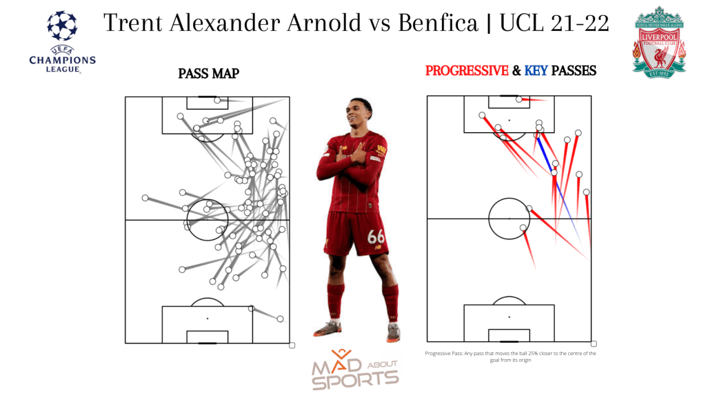
On the left is the pass map of all the passes attempted by Trent in the particular match. This pass map tells us from where Trent initiated his passes and where he targeted these passes. This also gives us an idea the areas of the pitch Trent was occupying while attempting his passes.
The pass map on the right demonstrates the progressive passes and key passes made by Trent against Benfica. Now, before moving ahead, it is necessary to understand how we define a progressive pass. So, a progressive pass is defined as any pass that moves the ball at least 25% closer to the center of the goal from the initial location of the ball. Any pass that leads to a shot is termed as a key pass.
While analyzing the passing performance of Trent from this particular game, it is crucial to understand that he was one of the key players in that Liverpool team in terms of ball progression. So, his progressive pass map helps an analyst to paint a picture of how he likes to progress the ball higher up the pitch.
This is how a basic pass map would look like but going forward in this blog, we will see how the passing performance can be analyzed with different forms of visuals to gain a better understanding of a player’s or team’s performance.
How can we analyse passes to assess a player’s ability?
There is no single way to plot these pass maps as everything depends on what aspect of the player’s passing one is trying to study. But usually while analysing passes, all the passes over a season or more gives a more accurate and a clearer picture of the player’s passing abilities.
For example, while analyzing a ball-playing center half it could be useful to see how he pings those long balls for the team’s attackers higher up the field. The visual below shows all the successful long passes played by Rúben Dias for Manchester City in the Premier League season of 2020-21.
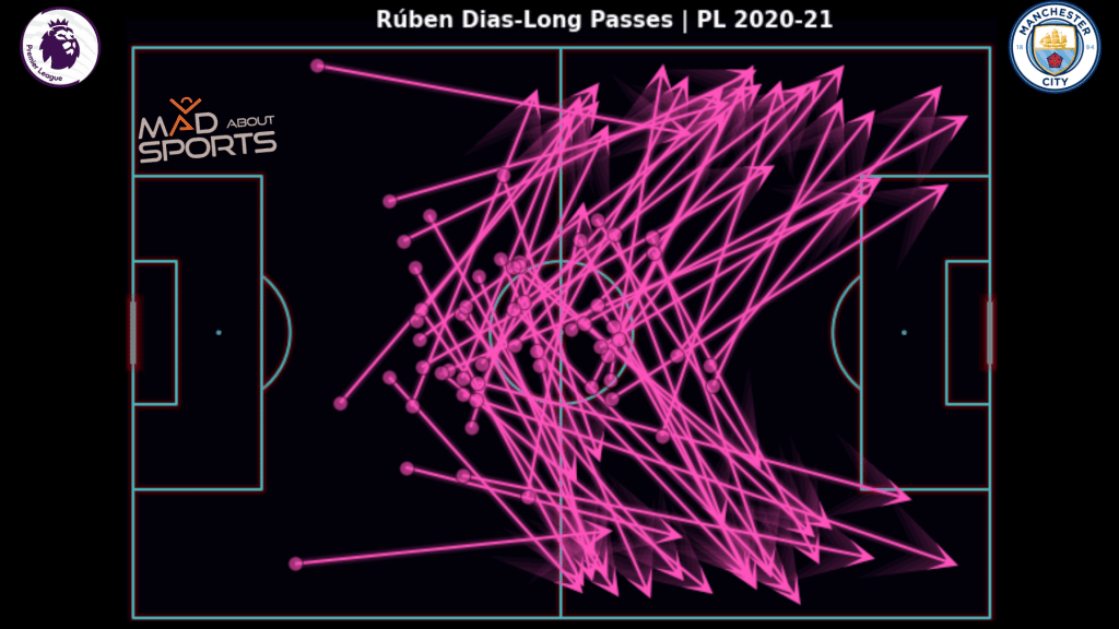
This pass map shows that Dias was very good at playing those long passes from the center of the pitch mostly from within his own half to either wing for the likes of Raheem Sterling, Riyad Mahrez, Phil Foden, and Bernado Silva.
This highlights the player’s ability on the ball and something teams playing possession-based football like Manchester City would ideally want from their center-half. Therefore, while scouting players or even analyzing opposition players before a match or tournament, analysts get necessary insights from these types of pass maps.
Why should we clutter passes?
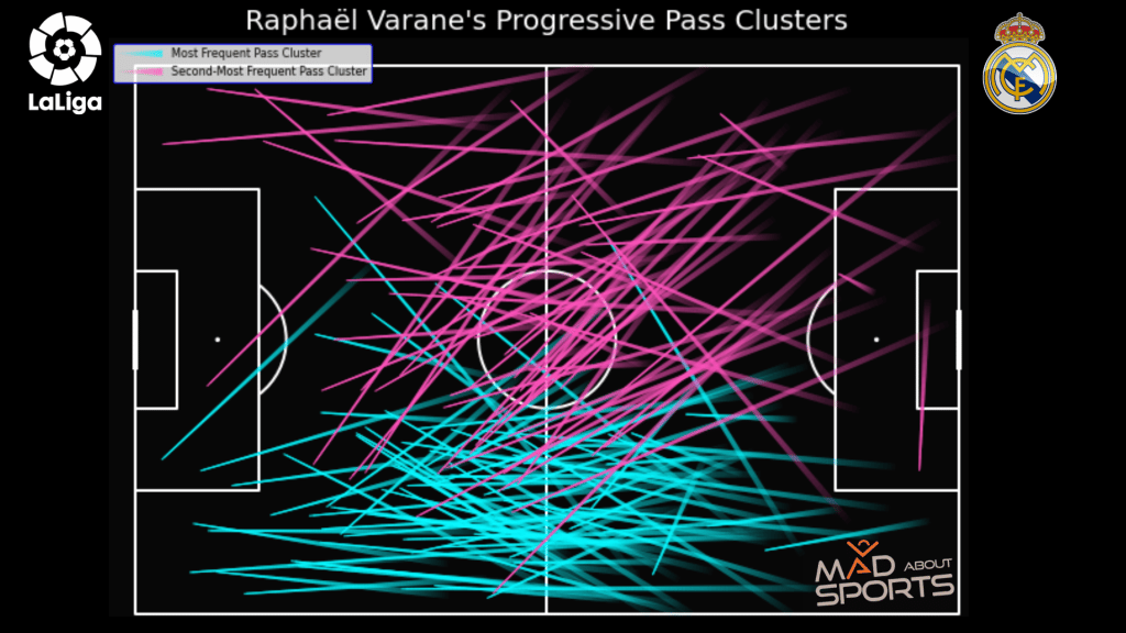
Clustering passes is another method of studying the passing habits of a particular player. This is largely done to see what the most common types of passes a player plays over the course of time. This again, gives the analysts a better understanding of how the type of passes a player is most likely to play on the pitch.
The pass map below shows the two most frequently played progressive passes by Varane during his last season at Real Madrid. It can be observed that a majority of his progressive passes end up at the right half-space and the right wing of the field. Consequently, it can be inferred that while looking to progress the ball, Varane likes to play his passes majorly to the right flank of the pitch.
The number of clusters one wants to divide the passes into is also subjective. Generally, while creating clusters, the top two-three clusters are considered while analyzing the passes. This is done to prevent finding patterns where there isn’t one.
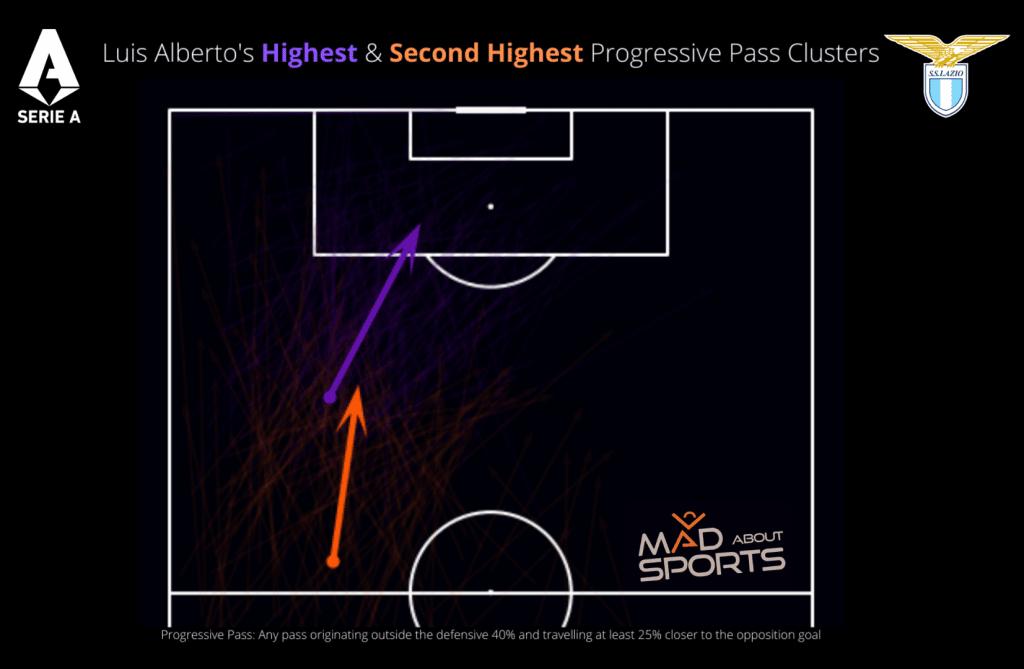
The above pass map illustrates how Luis Alberto progressed the ball for Lazio in Serie A. In the Lazio squad, Luis Alberto operated in between the opposition defense and the midfield and played penetrating passes forward. He also dropped deep to collect the ball from his defense and then progress the ball up field.
His two most frequent progressive pass cluster exactly highlights this. His most recurrent pass is from the left half-space into the penalty area, followed by the cluster that originates closer to the center circle from when he drops deep to help his team progress the ball.
How different pass types can be analysed to study a player?
Some of the other examples of the types of passes that can be plotted based on the profile of the player and his role in the team is passes into the penalty box or switches. Yacine Adli’s pass maps from his season at Bordeaux in 2021-22 shows his passing abilities from deeper areas as well as from higher up the field.
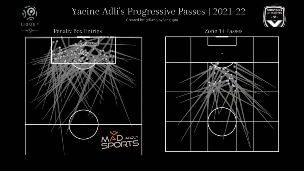
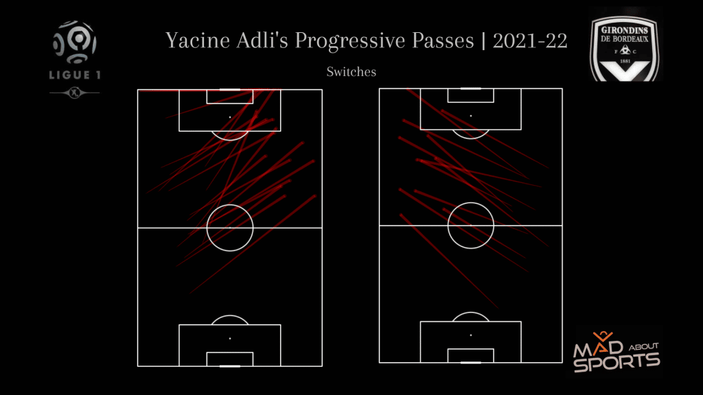
These two pass maps demonstrate two different aspects of Adli’s passing abilities. The first one reveals his abilities and skills when he passes the ball closer to the penalty area. While the second one establishes the fact that Adli can also switch the play very efficiently from either side of the pitch.
How to use heat maps to analyze a player’s passing profile?
Now we have seen how pass maps can be used by analysts to study the performance of a player. However, these are not the only way to do so. Pass heat maps are also widely used to understand the passing abilities of a player.
Let us see how the pass heat maps can be used by analysts using an example.
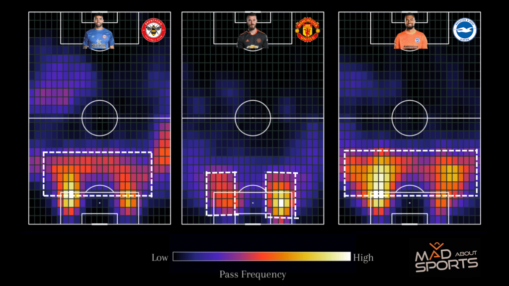
Over the course of the last season, a lot was discussed regarding the passing abilities or the lack thereof David De Gea of Manchester United. The above pass heat map shows the comparison of the pass end locations of all successful passes made by David De Gea, Robert Sanchez and David Raya. One can clearly see that the range of passing that De Gea possesses is very limited as compared to his Spanish counterparts.
Most of De Gea’s successful passes end up near his own penalty box whereas the distribution is much spread out for the other two goalkeepers. This piece of information can be used, for example, to replace De Gea for a keeper more comfortable on the ball, to carry out the vision of the manager of Manchester United.
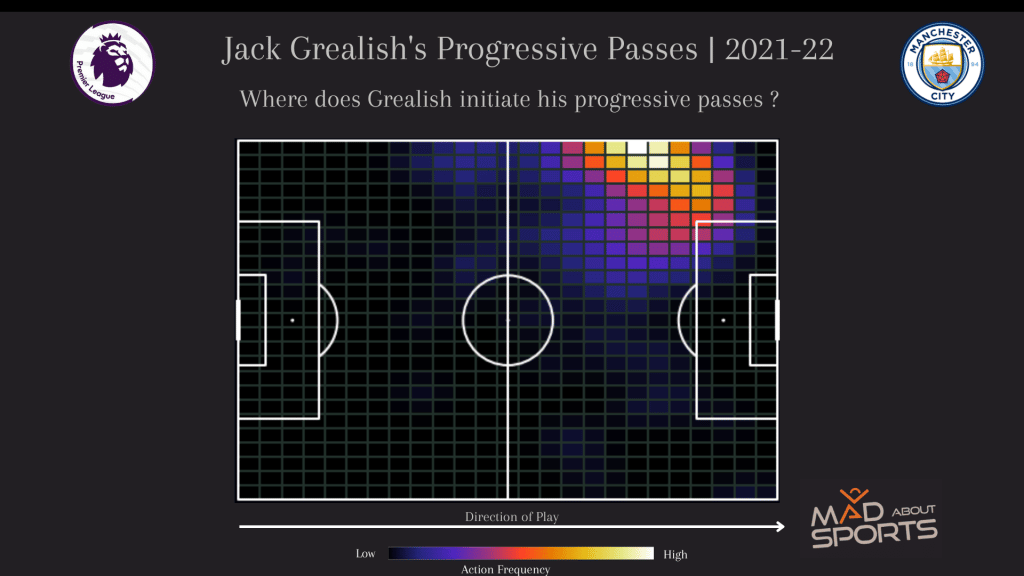
Pass heat maps can also be used by analysts to study the areas from where a player is making his passes. The heat map below depicts the areas on the pitch where Jack Grealish initiated his progressive passes in the Premier League last season with Manchester City.
This type of information would help the manager understand the traits of a player and thus assign him a role in the team accordingly.
How to use passes to understand a team’s setup?
Another kind of visual that is also very helpful in understanding the team structure during a game is the pass network. A pass network illustrates the average position of each player while making and receiving a pass during a game.
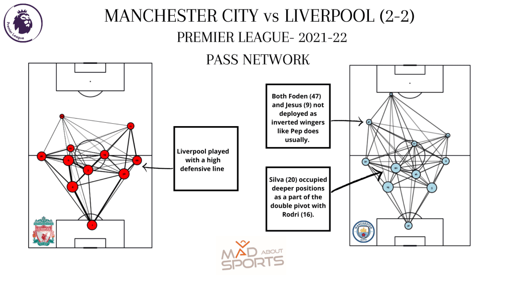
For example, in the above pass network, one can see the average positions of each player at the time of making/receiving a pass. This also gives an idea about the number of passes played between any two players. Furthermore, we also get an idea about the managers set up their respective teams during this game.
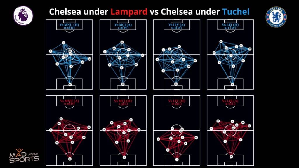
Here’s another example of how pass networks can be used to compare the team performance. This pass network shows how Chelsea lined up under Lampard and then under Tuchel against the same oppositions and the results they achieved.
What are some other pass metrics to evaluate the passing acumen of a footbaler?
Apart from the pass maps, pass network maps and pass heat maps, there are several other metrics to evaluate the passing proficiencies of a player. Some of the widely used passing metrics are:
- Passes Attempted
- Pass Completion Rate
- Progressive Passes
- Passes into the final third
- Key Passes
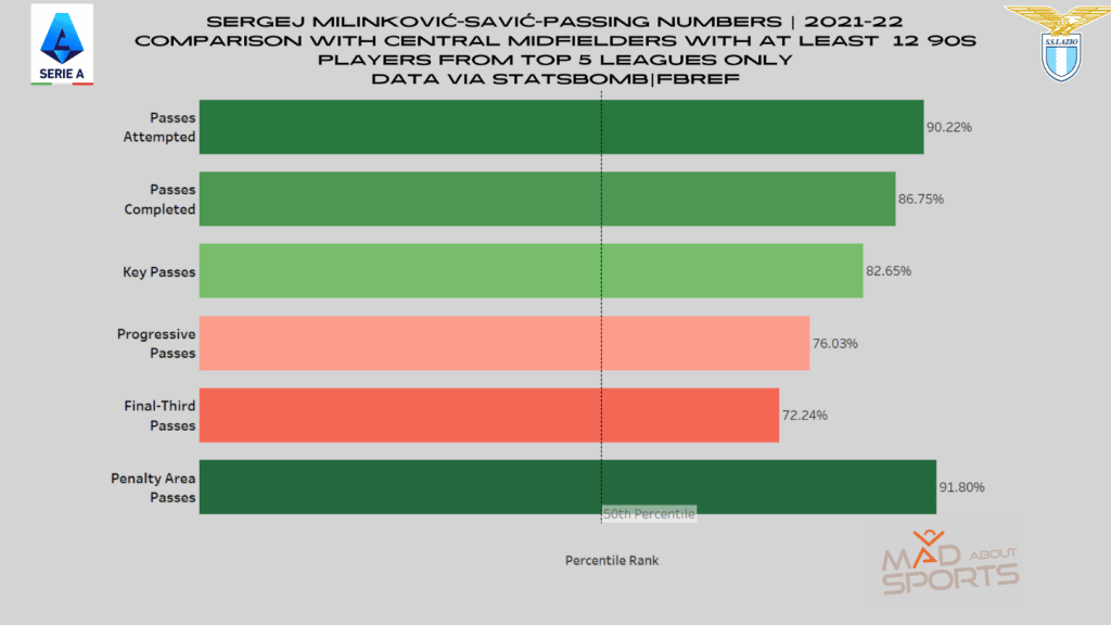
A percentile chart can be used to gauge the passing aptitude of a player as compared to other players across the various leagues in the same role. The percentile bar chart shown below compares the passing numbers of Sergej Milinković-Savić as compared to the other central midfielders of Europe’s top 5 leagues, given that the player has played a minimum of 12 90 minutes.
The percentile rank gives the viewers an idea about where the particular player stands among his peers. Higher the percentile rank better is the player’s abilities in that passing metric.
Some other ways to analyze passes
Scatter plots can also be used for player performance review. These are usually used to compare players based on two metrics that are plotted on each axis.
Let’s take the example given below.
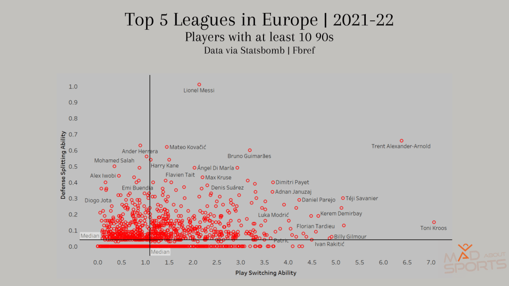
Through this scatterplot we can see how good a player is in switching the play (Switches) and how well can he make those defense splitting passes (through-balls).
Lionel Messi, a then Barcelona player is way ahead of the other players in terms of providing those through-balls whereas Toni Kroos of Real Madrid possess the skillset to switch play from one side to the other. Both of these are crucial skills to have in your arsenal as a player and are important metrics while analyzing player performance.
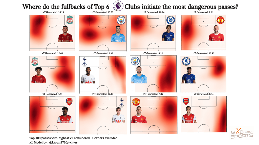
One more metric that has found great significance in recent times is the ‘xT’ or the Expected Threat matric. xT from passes calculate how threatening a pass is depending on the initial and the final position of the ball.
A higher value of xT means that the pass ended up in a dangerous area of the pitch which would more likely to create a scoring opportunity for the team involved. Like other heat maps discussed earlier, xT heat maps shows the areas from where the players make the passes with the highest xT.
In the below visual, we can see the areas from where the fullbacks of the top 6 teams of the Premier League made the most threatening passes. This heat map also paints a picture of the roles assigned to these players as despite all of them being a fullback for their respective side, everyone occupies a different area while playing their most dangerous passes near the opposition box suggesting the roles they take up and how their managers plan to use them.
Conclusion
Through this blog, we have seen why data analysts working with various football teams analyze passes via the use of not only pass maps but other visuals such as a pass network, heat map, scatterplots to derive insights about different players.
We have also seen how these analysts might use these data points and visuals to examine certain aspects of a player’s passing skill set and abilities depending on the need of the manager and the team. The use of analytics is increasing in football day by day, and pass maps are one important aspect of it!


